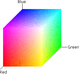
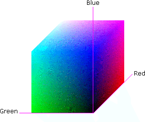
Color Spaces/Models ... how do we represent colors.
A color model is a 3D (or N-D) unique representation of a color. There are different color models and the use of one over the other is problem oriented. For instance, the color model RGB is used in hardware applications like TV monitors and cameras, the CMY color model is used in color printers, and YIQ model in television broadcast. In color image manipulation the most models widely used are RGB, HSI and HSV.
RGB
The simplest and most common lighting model is use use the red, green, and components R, G, and B. We use this for color monitors, scanners, image storage, etc.
It is not, however the best or most intuitive model to work with.
Experiment: split an RGB image into its three color bands
Shown below is an RGB image and its three color bands
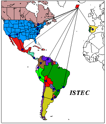 Color image
 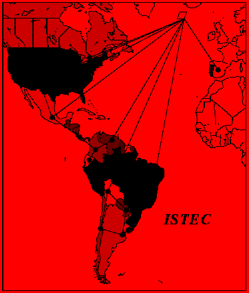 Red image
  Green image
  Blue image
CMY or CMYK
Red, green, and blue make useful primaries for additive light, but not for subtractive.
What we mean by subtractive color is that light reflected off of a surface is what the surface doesn't absorb. When we mix two colors on a surface, we thus mix what they absorb, not what they don't absorb. Each color subtracts its respective wavelengths from the reflected light instead of adding together.
If you mix red, green, and blue light, you get white. If you mix red, green, and blue paint, you get black (or close to it). For this reason, the subtractive primaries are better selected as cyan (blue-green), yellow (red-green mix of light), and magenta. (red-blue). Notice that each of these is the opposite or complementary color of the additive primaries.

For printing then, you'll often see the CMY model. Since it's very hard to mix these to get a perfect black (no surface really absorbs all of a particular wavelength), people also usually add pure black (K) to the mix and call it the CMYK model. If you look in a color printer, you'll probably see these four colors, not red, green, and blue.
YIQ
Another, more intuitive, way to describe color is to separate the intensity from the hue. One such color model that does this is the YIQ model. The Y component is the intensity, and the I and Q components describe the hue. (Don't worry about how they are encoded-that part's not very intuitive.)
Separating out the intensity from the other components has several advantages:
- Since our eyes are more sensitive to the intensity than to the hue, we can distribute the bits for encoding in a more effective way.
- We can drop the chromatic part altogether if we want achromatic images. (By the way, this is how black and white TVs can pick up the same signal as color ones--television uses something called the NTSC standard, which uses YIQ encoding.)
- We can do image processing on the intensity and color parts separately. For example, we can do histogram equalization on the intensity part to contrast enhance the image while leaving the relative colors the same--try that with RGB!
The YIQ model has the advantage over other methods that separate hue from intensity in that it can be computed as a linear function of the RBG values:

HSI
As I mentioned before, the I and Q parts of the YIQ model aren't very intuitive for describing the chormatic properties of light. Another, even yet more intuitive, model is the Hue-Saturation-Intensity or HSI model.
Think of this model as a a two-ended hexagonal pyramid. The middle hexagon has corners at the three additive and the three subtractive primaries. The middle is white or achromatic light. Thus, angle around the hexagon is the hue, and distance from the center axis is saturation. As you go up or down the pyramid, you add or subtract form the intensity of the light. When you get to no intensity, everything fades to black. As you increase the intensity (but bound each primary), everything becomes less saturated and evenetually becomes pure white. These lie at the tips of the double-tipped pyramid.
This is a very intuitive model for color artists working with light.
HSV
The Hue-Saturation-Value (HSV) model is similar to the Hue-Saturation-Intensity model but with a single circular cone to describe the space. Pure black lies at the tip of the cone, pure white at the center of the base, and pure hues around the perimeter of the base.
Intuitively, it is nearly the same to work with as the HSI model.
While HSI and HSV is intuitive for people, it is more complicated to go back and forth from. For this reason, many interactive systems use HSI or HSV while many image-processing systems use YIQ.
Chromaticity Space
Suppose that instead of describing light as amounts of red, green, and blue respectively, we chose three other primary wavelengths and response curves and describe light in terms of those. One choice might be to select one primary as matching the overall luminance-efficienty function of the eye and select the other two based on that. That is what the 1931 CIE color standard does.
The three primaries for the CIE color model are X, Y, and Z, where Y is chosen to match the luminance-efficiency function and X and Z are selected relative to that in order to describe the chromaticity. We can then describe all visible light as being some amount each of X, Y, and Z.
We can compute the total light as X + Y + Z, and we can normalize the light
by this intensity to get the relative hues: 
Notice that x + y + z = 1. If we consider the hue as a three-element vector
or point:  all of these points lie on the
plane passing through
  ,
,  , and
, and  .
.
We can actually get any point on this plane by simply knowing x and y (z = 1 - x - y). If we map the range of visible light on an (x,y) plane, they form a horseshoe-shaped curve ranging from red to blue. White light is the point in the middle where all three quantities are equal. Pure hues are along the periphery of the horseshoe. As you make a line from the edge hue to the white point, you trace out various levels of saturation.
Notice that if you pick any three points as primary colors, there are colors that cannot be made from them. The range of colors possible from some set of primaries is the gamut of color for those primaries, and it bounded by the lines between the primary points.
IMPORTANT: This color space is better than that of R,G,B in that it can be used to represent a larger number of colors.
